

Table Texture; May 2, 2011; Rexburg, ID; f/3.4; 1/15 sec
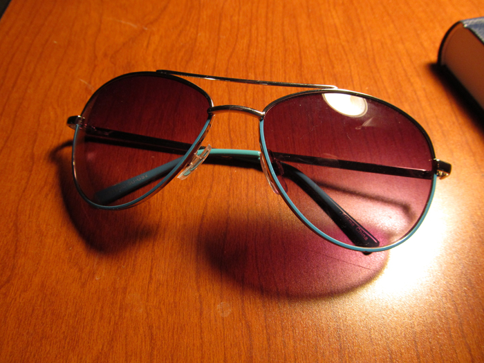
Sunglasses; May 2, 2011; Rexburg, ID; f/3.4; 1/30 sec
For this picture, I used a layer mask and made the top layer have 85% opacity, and then used a soft black paintbrush to fade out the background more than the lenses and the pages of the book. I set the opacity on the black paint brush to about 42% and alternated between using the black and the white paint brush until I was satisfied with the way it looked.


Memories; May 2, 2011; Rexburg, ID; f/3.4; 1/25 sec
Type Effects: For this image, I took a picture of a key chain I bought in Paris so for the title, I used the french word for "memories" which resembles the english word for souvenirs. To keep with the French theme, I added extra familiar french words and terms and had three different copies that I set to different opacities and one was set to a different font size.
I love your type blend. It's so simple and yet so unique. The large aperture you used help to create the strong and clear focus on the tower key chain. It also created great boca. I also really like the various words and sayings scattered throughout the image. Another thing that really fascinated me about your image was the varying opacity level of each word or phrase, helps create great depth of field. Finally, I really liked how only one word is in bold type and that word brought focus to the key chain. Very beautiful image editing and really nice shot.
ReplyDeleteBoth of your pictures look great. I love the type effect one the most. The effect is cool but I love the photo just as much. Good work. I also like the blending you did. The only thing I would suggest with that is to try and get the texture to show more on the light going through the lenses so it matches the color of the lenses. Besides that it looks awesome.
ReplyDelete